
TL;DR
Livingetc asked interior designers whether butter yellow is a lasting home color or a trend that may fade as 2027 approaches. Their views differ: some see lasting warmth and versatility, while others say the shade can feel overexposed if used everywhere; designers point toward deeper, earthier colors as possible successors.
Interior designers interviewed by Livingetc disagree on whether butter yellow will become a lasting home color or lose appeal as the current trend moves on, with several expecting a shift toward deeper, warmer, earthier shades as 2027 approaches. Their comments suggest the color’s staying power may depend less on the shade itself than on whether people use it because they genuinely like it—and how extensively they apply it.

Get furniture and decor delivered free with Prime
- Fast, free delivery on millions of items
- Prime Video, Amazon Music and more included
- Member-only deals all year
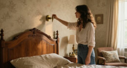
Designers cited in the report describe butter yellow as a soft, warm color that can work between a conventional neutral and a more pronounced accent. Its appeal, they say, comes partly from offering an alternative to stark white and cool gray without the intensity associated with brighter yellows. The shade can also pair with materials such as warm wood, natural stone, aged brass and patterned fabrics, according to designer Laura Stephens.
Opinions diverge on whether that versatility makes butter yellow timeless. Ailsa MacConnell of Edinburgh-based Studio Mac says the hue has a softness that lets it work across different palettes and does not see its current popularity as evidence that it is fleeting. Stephens, by contrast, says she would not treat the specific butter-yellow shade as timeless in the same way as cream or stone. She argues that any highly popular color can feel overexposed when used too literally or across too many surfaces.
The report also points to the role of personal preference and design choices. Color consultant Charlotte Cropper says a color’s longevity can depend on whether an individual has long been drawn to it. Kelsey Coppetti of Los Angeles-based Studio Marrant says using butter yellow only because it is fashionable may make it more likely to be replaced when another trend arrives. The article frames restraint—not a particular application—as one way to keep the shade from overwhelming a room.
A Trend With Practical Staying Power
The disagreement matters to homeowners deciding whether to use a fashionable color on fixed or costly-to-change surfaces. Butter yellow’s role as a warmer alternative to white and gray gives it practical appeal, but the designers’ cautions point to a difference between a color that suits a person’s taste and one adopted mainly because it is popular.
The report does not establish that butter yellow is objectively timeless, nor does it predict a definite replacement. Instead, it offers a useful distinction for decorating decisions: a soft shade may have broad compatibility, while its trend status and the way it is applied can change. Designers’ suggested move toward earthier, more nuanced tones signals an evolution in palette rather than proof that butter yellow is disappearing.
Products Worth Considering

Bose Lifestyle Ultra Wireless Home Speaker, White Smoke

Philips Hue Bridge Pro Smart Lighting Hub, 1-Pack

eufy Security Video Doorbell E340 Kit with Chime
As an affiliate, we earn on qualifying purchases.
Why Butter Yellow Returned
Butter yellow is not a new color in interiors. Rachel Rector of Florida design studio Chinotto House says it has appeared in 18th- and 19th-century European and American interiors, as well as Spanish Mediterranean, Victorian, Colonial Revival and mid-century spaces. The current attention is therefore a renewed use of a historically familiar shade, rather than the arrival of an entirely new color.
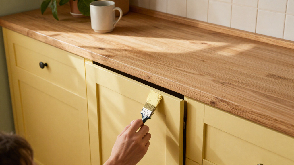
Designers quoted by Livingetc link its recent popularity to a broader appetite for softer, warmer rooms after years when white and cool gray were common choices. They describe butter yellow as a way to bring color into a room while retaining the ease of a pale neutral. Examples in the report include Farrow & Ball’s Hay paint, used on kitchen cabinets and bedroom joinery; those projects illustrate specific applications, not evidence of a market-wide shift.
““Butter yellow has been around for years and will be around for many more to come.””
— Ailsa MacConnell, Studio Mac
No Definite Successor Yet
The report presents designers’ opinions, not a measured forecast of how homeowners will decorate or a confirmed industry-wide color shift. It does not name one specific shade as butter yellow’s successor, provide sales or survey data, or establish when any change might happen. Its reference to deeper, warmer and earthier colors is a broad direction, not a precise prediction.
It is also unclear how long butter yellow’s current popularity will last. The designers disagree on whether it is already timeless, and several qualify their views by pointing to personal preference, the surrounding palette and the extent of its use. The available source gives no evidence that demand for the color has declined.
How the Palette May Evolve
As the design cycle moves toward 2027, Livingetc’s report suggests designers may favor colors with more depth, warmth and earthiness as a refreshed alternative to butter yellow. It does not set out a confirmed timetable or identify a single leading replacement, so that direction should be read as a forecast from the designers rather than a settled change.
For homeowners, the immediate decision is whether the shade works for their own space and preferences. The designers’ advice points to using it as part of a considered palette, rather than applying it everywhere simply because it is popular. Whether butter yellow remains a regular choice or gives way to other warm tones will become clearer as future design work and consumer choices emerge.
Key Questions
Do designers think butter yellow is timeless?
They disagree. Ailsa MacConnell sees it as a lasting shade, while Laura Stephens cautions against treating the specific color as timeless in the same way as cream or stone.
Why has butter yellow become popular in interiors?
Designers quoted by Livingetc say it brings warmth and softness while remaining easier to use than a brighter yellow. They also describe it as an alternative to stark whites and cool grays.
What colors could follow butter yellow?
The report points generally toward deeper, warmer and earthier shades, but does not identify a specific successor or confirm that a shift has already happened.
How can homeowners use butter yellow without overdoing it?
The designers’ comments support choosing the color because it suits the homeowner, then using it thoughtfully within a wider palette. The report does not prescribe a particular room or amount of coverage.
Source: rss